- Python 100%
| scripts | ||
| .gitignore | ||
| __init__.py | ||
| LICENSE | ||
| mmaker_color_enhance_comfyui.py | ||
| mmaker_color_enhance_core.py | ||
| pyproject.toml | ||
| README.md | ||
Color Enhance
Script for AUTOMATIC1111/stable-diffusion-webui and node for ComfyUI to enhance colors.
This is the same algorithm GIMP/GEGL uses for color enhancement. The gist of this implementation is that it converts the color space to CIELCh(ab) and normalizes the chroma (or "colorfulness") component. Original source can be found in the link below.
https://gitlab.gnome.org/GNOME/gegl/-/blob/master/operations/common/color-enhance.c
In my personal (and possibly subjective) opinion, this removes the need to select a VAE based solely on color, and instead select one on it's true merit of accurately converting the latent space to a pixel representation of the image.
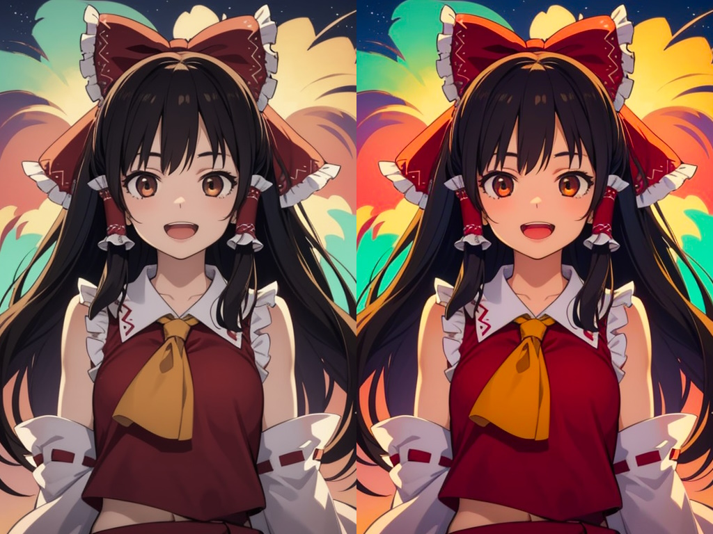
Example
Left is the raw output (with a manually selected VAE!), right is with the enhancement (at a full strength of 1).
Notes
To use this directly in the txt2img and img2img tabs, go to Settings -> Postprocessing, and add this script to the Enable postprocessing operations in txt2img and img2img tabs option. Save and restart the web UI to apply the changes.
This should not cause any issues with hires fix, inpainting, etc, as the postprocessing pipeline in the web UI only applies postprocessing scripts directly before returning the final image(s). There should also be no quality degradation from re-using the same image multiple times (as in inpainting), as operations are performed in floating point before being converted back to uint8. If you want to have peace of mind, you can always run this postprocessing script in the Extras tab as a last step.
If you were to test this out with an image you believe is already heavily saturated/colorful, and apply this at full strength, you should see essentially 0 change to the image, an indication of how working in this color space removes the need to worry about oversaturating or blowing out an image.
As far as I know, this technique dates back to the early 2000s. Examples can be seen here and here which show how this is an improvement over traditional HSL/HSV color grading. There has since been many new developments in this area, but I haven't quite yet looked into these, and this already seems to perform very well. An improvement may not be seen in new techniques anyway, as SD only outputs 24-bit RGB images, ultimately leaving color grading options limited.